Author Archives: Brian

Persuasive User Experience

This was my undergrad technical communication capstone project. Since I had an interest in both user experience and persuasive technology, I proposed writing a white paper explaining the methodology behind some of the techniques that could be used to enable website owners and administrators to establish credibility, build trust, and influence user behavior.

The paper would also introduce a specific type of consulting service, which would be a comprehensive heuristic evaluation designed to analyze a website’s user experience and determine how that site might best meet its persuasive goals.

The result was The Persuasive User Experience: Design and content strategies that establish credibility, build trust, and influence user behavior.

Course: Documentation Development and Completion

Project PDF: The Persuasive User Experience White Paper

Usability Test Report

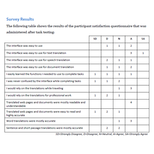
This report describes the purpose, objectives, and methodology of a usability test of Google Translate. Participant profiles and details of test procedures and tasks are included. Task performance and survey data are presented and discussed, and recommendations for improvement are proposed and rated for severity. Copies of the test script and participant satisfaction questionnaire are included in the appendices.

The project requirement was to plan, create, and run a usability test of three users based on a product or service of my choice and approved by the instructor. In addition to the usability test, the project needed to include details about the issues and their severity, as well as recommended improvements.

Course: Usability and User Experience

Project PDF: Usability Test Report for Google Translate

Usability Evaluation

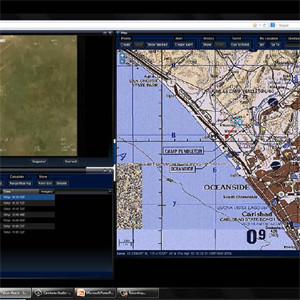
This was a team project. We conducted a usability evaluation of an industrial infrastructure security command and control interface. Two evaluation approaches were chosen to provide the maximum amount of constructive feedback for the designers. The first was a heuristic inspection conducted by two of the team members. The second was a usability evaluation conducted by a third team member using conventional task performance to assess usability, as well as a questionnaire to rate participant satisfaction with the interface design.

The tested software product has an operational concept to provide a security surveillance situational awareness interface for a large industrial site. The system includes a wide array of sensors, cameras, and devices to provide full support for a command center. For the study, we used a beta version of the software that excluded any hardware sensors.

Course: Methods in Human-Computer Interaction

Project PDF: Usability Evaluation of an Industrial Infrastructure Security Command and Control Interface 

Online Card Sorting Pros and Cons

Online card sorting applications increase the accessibility of running a card sort. They make it fast, cheap, and easy (depending on the scope and scale of the sort) to set up the sort, and to recruit participants. Also, the participants can complete the sort at their convenience. Another major time-saver of using an online tool is that the data is recorded as the participant performs the sort, rather than having to be compiled and manually entered afterwards.

Some drawbacks of using an online tool for card sorting (as with using any online tool to replicate any manual process) are that the tool can impose its own constraints on the process, and there is also always a chance that technical issues will frustrate the participant or cause the participant to abort the process altogether. Also, an online sort doesn’t provide any verbalized cues about the participant’s organizational rationale. Although this could be overcome by using a card sort tool such as  OptimalSort with a screensharing or conferencing tool to run a remote moderated sort.

Garrett’s UX Planes

In his book The Elements of User Experience, Jesse James Garrett provides a conceptual framework for user experience design that encompasses five planes:

  • Surface (images and text the user sees)
  • Skeleton (placement of elements)
  • Structure (interaction design and information architecture)
  • Scope (range of content and features)
  • Strategy (organizational goals and user needs)

There are dependencies between these five planes, and these dependencies impact design choices.

I’ve always liked Garrett’s framework. I think he captures the essential components of UX, and organizes them into a visual structure that can be used to drive the design process. Easily understandable frameworks are always helpful.

There is a wide range of heuristics, methods, and techniques that can be applied to the design process within any given plane of Garrett’s model. But his framework allows practitioners who may have different specialties (graphic design, content production, marketing, IA, etc.) to develop a shared understanding of the overall process and an appreciation for the interdependencies of their work.

I also enjoyed Garrett’s discussion of different architectural approaches to structuring content. I thought he made some important points about the distinctions between top-down and bottom-up architectures. He explained that top-down approaches are driven by strategic concerns, and can sometimes gloss over important content features. Bottom-up approaches, on the other hand, are tailored to site functionality or content, but can make it difficult to accommodate future changes.

Surveys for UI Evaluation

What are some advantages and disadvantages of using survey documents for evaluating user interfaces?

People are used to taking surveys, so they are generally widely accepted. They are easy for managers and designers to understand, an inexpensive way to gather feedback, and can result in a large base of statistical data. Of course, if the survey isn’t well-crafted and properly targeted from the beginning, the resulting data won’t be worth much.

Surveys can reveal much more about a user’s real feelings than simple analytics or quantitative measurements. However, some responses can be biased. But overall, I think surveys are very effective as long as clear goals are established before designing the survey, and the questions are well thought out and clear. I also think it’s a good idea to test a survey on a small group before deploying it to thousands of users.

Personally, I generally don’t mind taking surveys. But I must say I always bail out of a website survey if I was told it would be “brief,” and then I’m ten minutes into it with no end in sight. For those types of random, pop-up type surveys, I think it’s important to let the user know exactly what to expect.

Content Strategy Evaluation

This presentation summarizes the results of a content inventory, audit, and analysis of an educational website that offers instructional content for people interested in learning the Spanish language. The site offers free instructional content for beginners. For intermediate and advanced learners, the site offers a premium monthly subscription membership or a complete conversational Spanish course.

I selected this site for the project because: I was already familiar with the site’s content and structure; the modular structure of the site’s content simplified selecting a manageable subsection of the site that fit the scope of the project, and; the site offered a good deal of very useful content, but the content needed be presented in ways that better met business goals and user needs.

The content strategy goal was to provide quality instructional content that attracts the most possible users, while presenting it in a way that encourages them to pay for the full course.

My evaluation indicated that while the website did provide useful, relevant basic Spanish instructional content, significant improvements were needed for the site to remain relevant and competitive, attract more users, and increase sales.

Course: Content Strategy

Project PDF: Content Strategy Evaluation Results and Recommendations

Design for Health

PKyoU is a dietary management, analytics, and educational web application for adults with phenylketonuria (PKU). The application allows users to track and monitor their nutritional intake, and check the suitability of specific food items for the PKU diet. It also includes an educational component that allows users to increase their nutritional awareness through gamified learning.

The goal of this project was to design some type of assistive solution that helps enable independent living for persons with chronic illness, cognitive disabilities, or language barriers. The goal was to design a solution that is both desirable and usable, and that also considers the social, emotional, physical, and behavioral characteristics and lifestyles of the target audience.

Course: Visual Design for Human-Computer Interaction

Project PDF: EnableIT Project Report

Design for Social Inclusion

The goal of the project was to design an educational play experience intended to mediate social interactions between autism spectrum disorder (ASD) children and neurotypical children ages 6 to 12 years. Additionally, the project was meant to focus on the critical social and language skills needed by the target group, while not being branded as an “autism” product. Overall, the designed experience was supposed to be fun, interesting, and beneficial for both ASD children and their neurotypical peers.

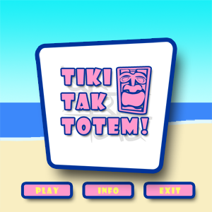
I decided that a browser-based game would be appropriate, since research indicates that computing applications have been successfully used to teach specific communication and social skills to autistic children. The result was Tiki-Tak-Totem, an interactive, two-player, tic-tac-toe-style browser game targeted to children in the 6-8 age group.

Course: Visual Design for Human-Computer Interaction

Project PDF: PlayIT Project Report 

On Norman

Don Norman’s The Design of Everyday Things is a classic in the design world. He uses simple case studies and proposes simple principles that we all already know through the mundane experience of existing and interacting with objects and artifacts.

We are people. We use things. Sometimes these things don’t work the way they should, or the way we think they should, so we need people like Don Norman to explain why.

Sometimes good design is a product of research and a deep understanding of form and function, and sometimes it’s just a happy accident. We can study it forever, but sometimes good design is nothing more than a minor modification of something that almost worked in the first place. That’s called innovation.

I love Norman’s book because he simply and beautifully illustrates some great points, and he coins a few good words that have become part of the design and user experience lexicon.

I don’t know if Norman’s book ever made me think differently about how things are designed, but it has certainly served to justify my outrage about poor design. Whenever I open a “re-sealable” package that doesn’t actually re-seal, I think of Don Norman. If nothing else, Norman got a lot of people thinking that even the simplest things that frustrate us because of their inherently poor design can be improved, if we bothered to care about improving such things.